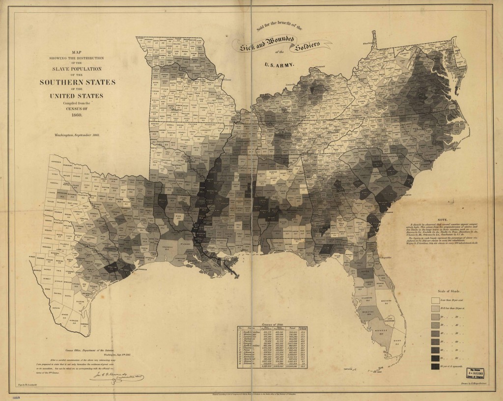
 Just a reminder that the maps like this one have a bitter past. Above is a map produced in 1861, at the start of the Civil War, based on census data from 1860. The map shows the slave population, as a percentage of the total population, per county through the Southern states. Throughout much of the South at the time, the population of slaves greatly exceeded the population of whites. The sales of the map helped the sick and wounded soldiers of the U.S. Army.
