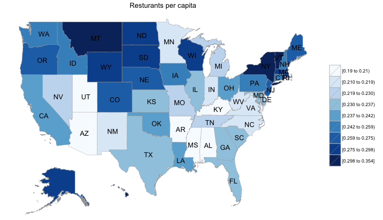
Every Friday, I’ll bring you a new map and plot in my attempt to understand the uniqueness of the South…quantitatively. I’ve found this great site called StateMaster that provides state level data for close to a thousand variables. This combined with the very easy to use R package choroplethr is providing all sorts of fodder. This week is the number of restaurants per capita from 2004 from National Restaurant Association.
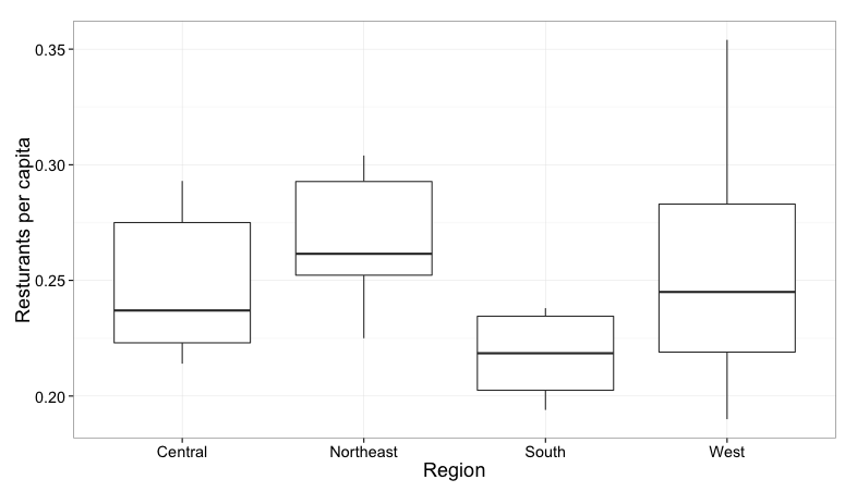
The map suggests the South is a bit of a restaurant food desert, something I can attest to every time I visit family in Arkansas and Alabama. However, the graph below really puts it in glaring view. An analysis of the data indicates that the South, in 2004, had a significantly (p=0.0205) lower number of restaurants per person.


